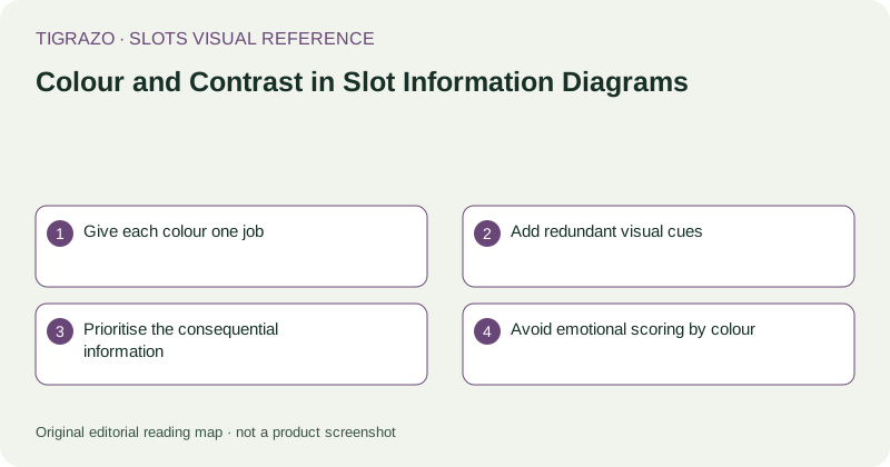
Give each colour one job
Assign colour to a specific category such as selected positions, qualifying symbols or later replacements. Reusing the same accent for all three may make the page attractive while forcing readers to guess which state they are seeing.
Use the legend to state each meaning in words. If a category changes between panels, repeat or revise the key. A colour convention is not self-explanatory merely because the designer has used it consistently in their own working notes.
Add redundant visual cues
Pair colour with labels, outlines, patterns or simple symbols. For example, a qualifying group can have both a border and a short group identifier. An excluded position can use a textual note rather than relying only on a red tint.
This redundancy helps readers with differing colour perception and those viewing a monochrome printout. It also helps when a small screen makes subtle hue differences hard to recognise.
Prioritise the consequential information
Total cost, multiplier bases, direction arrows and exception labels should remain readable at the final display size. Large decorative symbols do not compensate for a decimal point that disappears when the diagram is reduced.
Hypothetical example: a caption distinguishes a 0.05 line stake from a 1.00 total stake. If the unit labels are low contrast while a 20-times multiplier dominates the page, the diagram encourages a mistaken calculation even though every necessary number is technically present.
Avoid emotional scoring by colour
Green and gold can imply approval or value, while red may imply failure. In a comparison diagram, those associations can become an unsupported ranking. Use neutral category colours when the information describes different mechanics rather than better and worse options.
Likewise, do not make an unknown value appear visually deficient beside a documented value. Unknown means unavailable or unverified, not necessarily unfavourable. A plain labelled cell communicates that distinction better than a warning-coloured badge.
Review in more than one condition
Inspect the diagram at its intended size, at a smaller size and without relying on colour. Read the legend aloud against each mark. If the explanation fails when hue is removed, add a textual or structural cue rather than simply increasing saturation.
- Can categories be identified without colour?
- Do important labels have clear contrast?
- Are units readable beside numbers?
- Does emphasis match informational importance?
- Could the palette imply an unsupported recommendation?
A restrained diagram can still be engaging. Its success lies in preserving the reader's ability to distinguish conditions, units and states, not in making hypothetical awards feel more vivid than the rules that govern them.