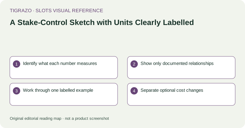
Identify what each number measures
A denomination might state the currency value of one credit. A line stake might state the amount allocated to one active line. A total stake might already combine the relevant components. These labels describe quantities, not interchangeable versions of the same number.
The sketch should put units directly beside values. A bare 10 could mean credits, lines, coins or a currency amount. Readers should not have to infer the unit from the size of the number or its position near a button.
Show only documented relationships
Use an equation when the rules explicitly define the connection between controls. Do not assume that every game uses denomination multiplied by coins multiplied by lines. Some systems fix parts of the configuration or use a different basis entirely.
Where the control already shows the total round cost, label it as such. Redundantly multiplying an already combined amount by another displayed number can produce a serious overstatement.
Work through one labelled example
Hypothetical example: assume a stated configuration uses 20 active lines at 0.02 per line. The total stake is 0.40 per paid round. If ten such rounds are initiated, their combined wager volume is 4.00, regardless of the awards credited during those rounds.
Place the equation beside the sketch rather than hiding it in a distant caption. If fictional credits are used instead, give a separate conversion before showing currency arithmetic. Never let an unlabeled credit value masquerade as money.
Separate optional cost changes
An optional mode may change total cost without changing the most visually prominent base-stake number. Give any added charge or revised total a separate line. The diagram should show what would actually be committed by the next action under the illustrated configuration.
Purchase features also need their own cost label. A feature priced as a multiple of a base stake is a separate transaction amount, not merely a more decorative version of the ordinary round price.
Check readability at practical size
Use enough contrast and text space for decimal points, currency indicators and qualifiers. A schematic that makes the start button huge but the total cost nearly invisible has reproduced a usability problem rather than explained it. Functional hierarchy should favour the consequential amount.
- Does every number have a unit?
- Is the total cost unambiguous?
- Are component equations documented?
- Are optional charges separate?
- Can readers distinguish wager volume from net loss?
The finished sketch should explain a configuration without encouraging its use. It is successful when a reader can state the cost accurately or identify the exact missing information that prevents doing so.